You’ll find that retro color palettes hold powerful meanings tied to their eras. Bright, psychedelic hues from the 1960s symbolize rebellion and individuality, reflecting societal shifts towards freedom. Pastel shades of the 1950s evoke innocence and optimism, reinforcing traditional values. Deep, luxurious tones of the Art Deco era symbolize wealth and sophistication. Earthy, muted tones of the 1970s express environmental consciousness and social awareness. Exploring these palettes reveals how colors mirror cultural values—continue to discover the fascinating stories behind them.

Get furniture and decor delivered free with Prime
- Fast, free delivery on millions of items
- Prime Video, Amazon Music and more included
- Member-only deals all year
Key Takeaways
- Retro color palettes often symbolize societal values, such as freedom in the 1960s or optimism in the 1950s.
- Bright, vibrant hues reflect cultural movements like rebellion and experimentation.
- Muted, earthy tones indicate shifts toward environmental awareness and social consciousness.
- Deep, rich tones convey luxury, sophistication, and societal aspiration, especially in Art Deco styles.
- Colors serve as visual cues to historical context, reinforcing themes of stability, liberation, or cultural change.
Color palettes are powerful tools that evoke emotions and convey meaning, especially when rooted in retro styles. When you look at vintage fashion, the colors used often tell stories beyond just aesthetics—they reflect cultural symbolism and societal values of their time. These palettes aren’t just eye-catching; they carry historical significance, giving each piece a deeper layer of meaning. Understanding the cultural symbolism behind these colors helps you appreciate the intentional choices designers made and how those choices resonated with the cultural currents of their era.
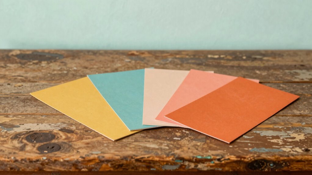
Take, for example, the bold, vibrant palettes of the 1960s. Bright yellows, oranges, and pinks defined the era’s psychedelic movement, symbolizing freedom, experimentation, and rebellion. When you wear or incorporate these colors, you’re connecting to a time when society was shifting, challenging traditional norms, and embracing individuality. These hues weren’t just visually stimulating—they represented a cultural push for liberation, making them a powerful statement in vintage fashion. Similarly, the pastel shades of the 1950s, like mint greens, baby blues, and soft pinks, evoke a sense of innocence, optimism, and domesticity. These colors reflect a post-war society *enthusiastic* to rebuild and find comfort in familiar, gentle tones. Wearing these shades can remind you of a time when home life and traditional values were celebrated, serving as a nostalgic link to that era’s cultural symbolism.
The deep, rich tones of the Art Deco period, such as navy, gold, and emerald green, also carry cultural significance. They symbolize luxury, status, and sophistication, aligning with the glamour of the Roaring Twenties. When you see or choose these colors, you’re tapping into a sense of opulence and societal aspiration. Moreover, the use of color psychology in these palettes helped reinforce the themes of wealth and exclusivity that defined the era. Additionally, understanding cultural symbolism behind these palettes can deepen your appreciation for how fashion communicates societal values across different eras. In the 1970s, the earthy, muted palettes of olive greens, browns, and burnt oranges reflect a shift toward naturalism and social consciousness. These colors symbolize a connection to nature and a rejection of previous excess, echoing the decade’s environmental and political movements. Recognizing the historical context of these colors allows you to see how fashion was used as a means of societal expression and change, and the psychological impact of these hues influences how they evoke specific emotional responses.
Frequently Asked Questions
How Do Retro Color Palettes Influence Modern Design Trends?
Retro color palettes influence modern design trends by evoking vintage nostalgia and creating emotional connections through color psychology. You’ll notice designers incorporate these hues to evoke feelings of comfort, fun, or sophistication, making spaces or products more relatable. Vintage-inspired palettes add a timeless appeal, blending the past with the present, and help you craft designs that resonate emotionally, drawing people in with familiar yet fresh aesthetics.
What Cultural Factors Shaped Popular Retro Color Choices?
Cultural factors like fashion nostalgia and vintage branding heavily influence popular retro color choices. You’ll notice these palettes evoke feelings of the past, drawing on styles from the 60s, 70s, or 80s, which resonate with a longing for simpler times. Brands often use vintage-inspired colors to evoke authenticity and nostalgia, connecting emotionally with audiences and making designs feel timeless yet trendy.
Are There Specific Industries That Favor Certain Retro Palettes?
Think of industries as painters, choosing palettes to evoke emotions. Vintage branding and nostalgic marketing often favor retro palettes in fashion, tech, and food sectors. These colors create a sense of trust and familiarity, making products stand out. For example, tech brands may use pastel shades to appear friendly, while food companies choose warm, inviting tones. Your industry’s choice of retro colors can substantially influence consumer perception and engagement.
How Have Retro Colors Evolved Over Different Decades?
You’ve seen how retro colors evolve over decades, reflecting vintage nostalgia and shifting cultural trends. In the ’60s, bold, psychedelic hues symbolized freedom and experimentation, while the ’80s embraced neon shades for energy and excitement. Over time, color symbolism shifted, blending past influences with modern tastes. You notice these changes in design, fashion, and branding, showcasing how retro palettes adapt while still evoking nostalgic feelings across generations.
Can Retro Color Palettes Impact Emotional Responses Today?
Retro color palettes can definitely impact your emotional responses today. They evoke emotional nostalgia, reminding you of past eras, which can bring comfort or joy. The psychological impact of these colors influences your mood, making you feel more relaxed, energized, or nostalgic. By incorporating retro palettes into your environment or designs, you tap into these emotional cues, creating a powerful connection that can shape your feelings and perceptions actively.
Conclusion
Understanding retro color palettes isn’t just about aesthetics; it’s about connecting with a specific era’s emotions and cultural nuances. Did you know that certain shades, like pastel pinks and teals, saw a 20% increase in use during the 1950s? By embracing these palettes, you tap into a nostalgic vibe that resonates deeply and evokes timeless feelings. So, next time you choose colors, consider their story—you might just discover a powerful emotional connection.
Halloween Picks
halloween
As an affiliate, we earn on qualifying purchases.