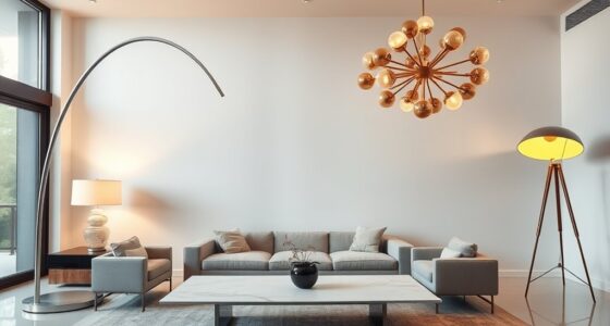
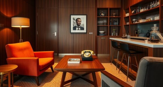
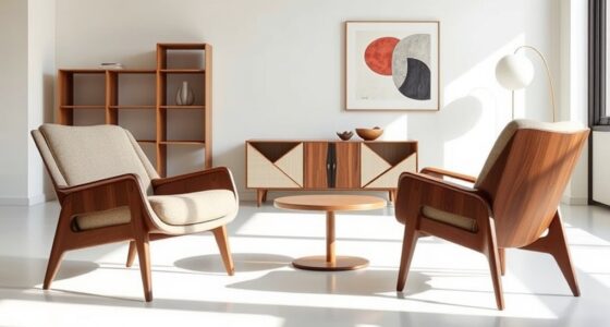
Mid-century modern color palettes are characterized by bold primary colors like red, blue, and yellow, alongside earthy tones such as olive green, mustard yellow, and warm browns. Soft pastels like blush pink and mint green add subtle elegance. Contrasting hues and natural-inspired shades create vibrant yet balanced environments. Metallic finishes like brass and gold highlight architectural features. If you want to explore how these colors define the era, you’ll find more inspiring details ahead.
Key Takeaways
- Bold, vibrant primary colors like red, blue, and yellow were central to mid-century modern palettes.
- Earth tones such as olive green, mustard yellow, and warm browns created natural, grounding environments.
- Pastel shades like blush pink, mint green, and soft blue added subtle elegance and lightness.
- Contrasting colors and color blocking techniques energized spaces and highlighted architectural features.
- Natural-inspired hues combined with metallic accents like brass and chrome defined the era’s optimistic aesthetic.

Framed Colorful Abstract Wall Art for Living Room, 3 Piece Mid-century Modern Canvas Prints Paintings Artwork for Walls, Bright Yellow Block Lines Pictures for Hallway Dining Bedroom Wall Decor -16×24
[Solid Wood Framed Wall Art]: A set of 3 contemporary framed abstract paintings (each 16" W x 24"…
As an affiliate, we earn on qualifying purchases.
As an affiliate, we earn on qualifying purchases.
The Vibrant Roots: Bold Primary Colors

Have you ever noticed how bold primary colors define the essence of Mid-Century Modern design? These colors—red, blue, and yellow—are the foundation of primary color schemes that make spaces lively and energetic. You’ll often see color blocking used to create striking visual contrasts, where blocks of bright hues are paired together for maximum impact. This technique emphasizes simplicity and clarity, making each element stand out. Primary colors in Mid-Century Modern interiors aren’t shy; they command attention and set a vibrant tone. They’re often combined with sleek, minimalist furniture to keep the focus on the bold hues. This approach celebrates the playful, optimistic spirit of the era—where color isn’t just decoration but a statement of boldness and innovation. Incorporating colorful planters can further enhance the lively atmosphere characteristic of this design style. Understanding color theory can help you create harmonious and eye-catching color combinations that truly embody the Mid-Century Modern aesthetic. Additionally, the use of color psychology can guide you in selecting hues that evoke specific moods and feelings, enriching your interior design. Exploring local spearfishing spots can also inspire a sense of adventure and discovery akin to the boldness of Mid-Century Modern colors.

UTTCMK Abstract Art Thinker Statue – Reading Thinker Sculpture Figurine, Modern Home Decoration for Living Room Office Shelves Coffee Table Desk Decor (Gold)
Aesthetic Decor: The reading thinker statue is a great addition to any bookshelf. It depicts a thinker reading…
As an affiliate, we earn on qualifying purchases.
As an affiliate, we earn on qualifying purchases.
Earthy Tones and Muted Hues: Reflecting Nature

Earthy tones and muted hues bring a sense of calm and harmony to Mid-Century Modern spaces by reflecting the natural world. You’ll notice how these colors evoke natural inspiration, creating cozy, inviting environments. Earthy neutrals like warm browns, soft greens, and gentle beiges ground your design, making it feel balanced and timeless. These hues work beautifully with wood finishes and organic textures, enhancing the overall aesthetic. Incorporate these colors to foster tranquility and connection to nature. They also serve as versatile backdrops that let accent pieces stand out. Whether you choose to highlight a clay-inspired terracotta or a muted olive, these shades keep your space grounded and sophisticated. Embracing natural color palettes helps to create authentic and sustainable design choices that resonate with eco-conscious living. Additionally, understanding color harmony can ensure these hues work seamlessly together for a cohesive look. Incorporating sustainable materials further enhances the eco-friendly appeal of your design, aligning with the earthy tones that celebrate nature. Recognizing the color temperature of these hues ensures they complement the overall lighting and atmosphere of your space.

Mindoub 6 PCS Pastel Calm Down Corner Throw Pillowcase 18×18 Inch Square Throw Pillow Covers Reading Nursery Home Bedroom Decor Teacher Counselor(Covers Only)
ADORABLE COLOR: These solid color pillow cases are teacher and school counselor office must have and it can…
As an affiliate, we earn on qualifying purchases.
As an affiliate, we earn on qualifying purchases.
Pastel Accents and Soft Shades

Soft shades and pastel accents bring a delicate touch to Mid-Century Modern spaces, infusing them with subtle elegance and a sense of lightness. For interior wall colors, consider gentle hues like blush pink, mint green, or soft blue to create a calming backdrop. These shades work well with fabric and upholstery choices, such as plush cushions, velvets, or linen furnishings, that feature muted or pastel tones. When selecting furniture or décor, opt for clean lines and simple silhouettes that highlight the soft color palette without overpowering the space. Pastel accents are perfect for accessories like throw pillows, curtains, or area rugs, adding visual interest while maintaining the understated sophistication characteristic of the era. Incorporating color harmony principles can help achieve a balanced and cohesive look. Applying color theory can enhance the overall visual harmony and emotional impact of the space. Utilizing complementary colors can further elevate the aesthetic and create a more dynamic environment. Understanding the horsepower of electric dirt bikes can inspire the selection of energetic and vibrant accent colors, adding a lively touch to the space. Additionally, considering the psychology of color can help evoke specific moods and atmospheres within the design. This balanced approach results in a welcoming, airy environment.

DRACIT Green Abstract Framed Canvas Wall Art Set, Modern Brush Strokes Wall Decor,Neutral Tone Minimalist Green and Black Color Block Art Print for Living Room,Bedroom,Dining Room, Office-24 x36 x3
【Textured Green Bold abstract Wall Art】The Size of the framed canvas wall art set is: 24×36 inchx3pcs (60x90cmx3pcs).This…
As an affiliate, we earn on qualifying purchases.
As an affiliate, we earn on qualifying purchases.
Metallic Finishes and Luxe Highlights

In Mid-Century Modern design, metallic finishes and luxe highlights serve to elevate the overall aesthetic with a touch of sophistication. You’ll notice the use of luxury metallics like brass, chrome, and gold accents that add depth and elegance to furniture and accessories. These luxe highlights catch the light beautifully, creating a dynamic and inviting space. Incorporate metallics through hardware, lighting fixtures, or decorative objects to infuse your room with a subtle shimmer. The key is to balance these finishes so they enhance without overwhelming the space. Think about pairing warm metallics with soft hues or cool metallics with bold colors for a refined look. These luxe highlights bring a timeless charm that emphasizes quality and craftsmanship in your mid-century modern decor. metallic finishes can also be used strategically to highlight architectural features or focal points within a room. For optimal impact, consider metallic finishes’ reflective qualities, which can amplify the sense of space and light in your design. Additionally, understanding the self-watering plant pots concept can help you maintain thriving greenery as part of your decor. Incorporating payment security measures can further enhance the safety of your online transactions and protect your investments. Integrating metallic accents thoughtfully can further enhance the textural interest and overall harmony of your space.
Modern Combinations: Mixing and Matching Colors

Mixing and matching colors is at the heart of creating a vibrant mid-century modern space. One effective technique is color blocking, where you combine bold, contrasting hues in large areas to create visual interest. Think of pairing teal with warm orange or mustard yellow with deep blue—these combinations energize your room. Alternatively, monochromatic schemes use varying shades and tints of a single color to produce a cohesive, sophisticated look. You might select different tones of green or gray, balancing light and dark to add depth without overwhelming the space. Both approaches allow you to express personality and style while maintaining the era’s signature simplicity. When mixing and matching, aim for harmony and contrast to highlight your unique aesthetic, making your mid-century modern space truly stand out. Incorporating color psychology insights can also help evoke specific moods and enhance the overall ambiance of your design. Additionally, understanding regional color trends can help tailor your palette to current aesthetic preferences. Exploring how environmental factors influence color choices can further refine your design to create a harmonious space.
Frequently Asked Questions
How Did Mid-Century Modern Colors Influence Contemporary Interior Design Trends?
You see how mid-century modern colors influence contemporary interior design through their focus on color psychology, creating spaces that evoke specific moods. You can apply these colors using simple techniques like accent walls or color blocking, making your space feel both retro and fresh. This era’s bold, yet balanced palettes encourage you to experiment with color application techniques, blending vintage vibes with modern aesthetics to craft inviting, stylish environments.
What Cultural or Historical Events Shaped Color Choices During the Era?
Imagine walking through a bustling 1950s street, where cultural influences on color blend with historical events shaping palettes. The post-World War II optimism sparks vibrant, lively hues, while the rise of consumerism and technology introduces sleek, bold shades. These cultural shifts and significant events like the space race inspire futuristic tones, reflecting a society enthusiastic for progress and innovation. Your surroundings mirror this dynamic, optimistic spirit through mid-century modern colors.
Which Color Palettes Are Most Popular for Outdoor Mid-Century Modern Spaces?
You’ll find that outdoor color palettes featuring bold, vibrant hues like teals, mustard yellows, and burnt oranges are most popular for mid-century modern garden colors. These palettes create striking contrasts and complement natural surroundings beautifully. Incorporate clean lines and minimalist furniture to enhance the mid-century modern style. Bright accent colors, mixed with neutral tones, help you achieve a timeless, stylish outdoor space that captures the essence of the era.
How Can Homeowners Incorporate Vintage Palettes Into Modern Decor?
You can incorporate vintage palettes into your modern decor by using vintage color pairing to create a nostalgic yet fresh look. Add retro-inspired accents like bold cushions, artwork, or accessories in classic hues such as avocado green, mustard yellow, or burnt orange. Balance these with sleek, contemporary furniture to keep the space feeling current while celebrating the charm of mid-century modern design. This approach makes your decor both timeless and trendy.
Are There Specific Color Combinations to Avoid in Mid-Century Modern Design?
Think of it like a jazz solo—avoid clashing color combinations and overly saturated palettes that clash. You should steer clear of pairing too many bold hues or mixing incompatible shades, like bright orange with deep purple. Instead, focus on balanced, harmonious color schemes. This keeps your space feeling vibrant but cohesive, ensuring your mid-century modern design remains stylish without overwhelming the senses.
Conclusion
Embrace the boldness, the earthiness, the softness, and the shine of mid-century modern colors. Mix the vibrant with the muted, the warm with the cool, the matte with the metallic. Let these palettes inspire your space, ignite your creativity, and reflect your style. Because in this era, colors weren’t just shades—they were statements, expressions, and foundations of a timeless design aesthetic. Make your space a reflection of this colorful, dynamic era.


