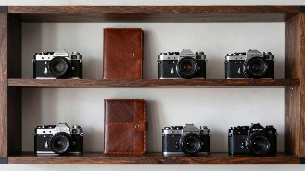

The one editing rule that instantly makes your collection look more expensive is consistently matching your background and color tones across all images. When you control lighting, background color, and overall color correction, your collection appears cohesive and polished. This creates a seamless visual flow that guides the viewer’s eye smoothly and boosts perceived quality. Mastering this simple step elevates your work to a professional level, and if you keep exploring, you’ll discover how to perfect this technique even further.

Get furniture and decor delivered free with Prime
- Fast, free delivery on millions of items
- Prime Video, Amazon Music and more included
- Member-only deals all year
Key Takeaways
- Maintain consistent background color temperature and exposure across all images.
- Use subtle color correction to unify tones without over-editing.
- Ensure lighting and shadows are harmonious for a cohesive look.
- Focus on creating a natural, authentic background that enhances the subject.
- Apply uniform editing practices to establish a polished, high-end visual flow.
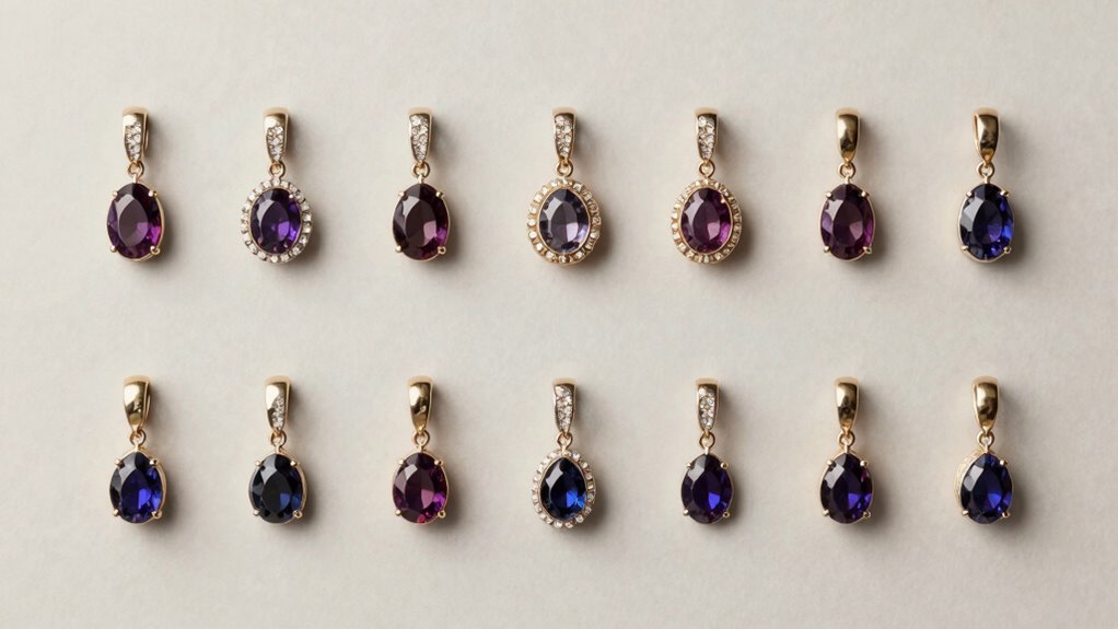
Ever wondered how some collections instantly look more luxurious and cohesive? The secret often lies in a simple yet powerful editing rule: maintaining background consistency through effective color correction. When you’re curating a collection—be it on a website, social media, or print—each image should feel like part of a unified story. This isn’t about making everything identical but about guaranteeing that the tones, shades, and overall mood align seamlessly. That’s where background consistency and color correction come into play, transforming an ordinary collection into one that looks polished and expensive. Focusing on visual harmony ensures your entire collection resonates with a refined, cohesive aesthetic. Color correction is your best tool for achieving harmony across your images. It involves adjusting the hues, brightness, contrast, and saturation to match a desired aesthetic. When you apply consistent color correction, each photo’s background will look like it belongs to the same visual universe. If one image has a warm, golden tone, and the next feels cool and blue, your collection will appear disjointed. By standardizing these tones, you create a visual flow that guides the viewer’s eye smoothly from one image to the next, making the entire collection feel curated and sophisticated. Background consistency is equally essential. Even minor discrepancies in lighting or background color can disrupt the overall sense of cohesion. For example, if you’re showcasing clothing or products, a slightly off-white or uneven background can make your images seem amateurish or unprofessional. You want each background to be clean, uniform, and free of distracting elements. When you guarantee that every background maintains the same color temperature and exposure, it elevates the perceived quality of your collection. It’s about controlling the environment behind your subject so that nothing pulls attention away from what matters most. Incorporating consistent editing practices can help streamline your workflow and ensure a professional look across all images. Additionally, understanding how different color spaces affect your edits can enhance your ability to achieve true color fidelity. Combining color correction with background consistency doesn’t mean you have to over-edit. Instead, focus on subtle adjustments that unify your images. Think of it as creating a visual thread that ties everything together without stripping away the authenticity or natural appeal of each shot. Use tools like white balance adjustments, tone curves, or selective color edits to match backgrounds. The result is a seamless, cohesive collection that looks intentionally curated—one that feels more expensive simply because it appears thoughtfully and professionally assembled. In the end, the key is to be deliberate with your editing choices. When you master color correction and background consistency, you craft a visual narrative that’s both attractive and credible. The collection doesn’t just look good; it exudes quality, making your audience perceive it as more valuable. It’s a small change with a significant impact—one that instantly elevates your entire presentation and makes your work stand out.
Products Worth Considering

Philips Hue Large Smart Light Tube, Black – White and Color Ambiance LED Color-Changing Light – 1 Pack

Philips Hue Bridge Pro Smart Lighting Hub

Ring Alarm 14-Piece Wireless Security System Kit
As an affiliate, we earn on qualifying purchases.
Frequently Asked Questions
How Do I Identify the Key Pieces to Highlight?
To identify the key pieces to highlight, focus on statement consistency and focal piece selection. Choose items that stand out with unique design, quality, or significance, and guarantee they complement each other. Prioritize pieces that reflect your style and can serve as anchors in your collection. By highlighting these, you create a cohesive, visually appealing display that looks more curated and expensive, drawing attention to your best selections.
What Colors Work Best for an Upscale Look?
For an upscale look, stick to neutral shades like black, white, or beige, which evoke elegance through color psychology. Monochrome palettes are perfect because they create a sophisticated, cohesive feel. You can add subtle metallic accents or deep jewel tones for richness. Avoid loud or overly bright colors, as they tend to detract from a luxurious vibe. Keep it simple, refined, and purposeful for the most upscale impression.
Should I Mix Different Styles or Keep It Uniform?
Think of your collection as a symphony—staying in tune creates a harmonious melody. Mixing styles can sound chaotic, while maintaining a consistent theme ensures visual harmony. You want your pieces to dance together effortlessly, like a well-choreographed routine. Stick to a cohesive style, and your collection will look polished and upscale, like a beautifully curated gallery. Consistency is the conductor that transforms random notes into stunning artistry.
How Often Should I Update My Collection?
You should update your collection regularly, ideally every few months, to keep it new and exciting. Incorporate vintage accents and statement pieces to add unique charm and elevate the overall look. By revitalizing your collection periodically, you guarantee it remains relevant and reflective of your evolving style. This approach keeps your space dynamic, interesting, and more valuable, making it feel more curated and expensive over time.
What Accessories Complement a Curated Collection?
Imagine your collection as a story waiting to be told. To elevate it, add vintage accents and statement jewelry that act as punctuation marks, drawing attention and adding character. These accessories create visual interest and contrast, making your collection appear more curated and sophisticated. Be intentional with each piece, ensuring they complement your collection’s theme and style, transforming it into a compelling narrative that’s both timeless and elegant.
Conclusion
Remember, less is more. By applying this simple editing rule, your collections will look more polished and expensive without the extra effort or cost. When you focus on quality over quantity, you elevate your entire aesthetic. As the saying goes, “A picture is worth a thousand words,” so make each piece count. Trust this rule, and watch your collections transform into refined, sophisticated displays that truly impress.