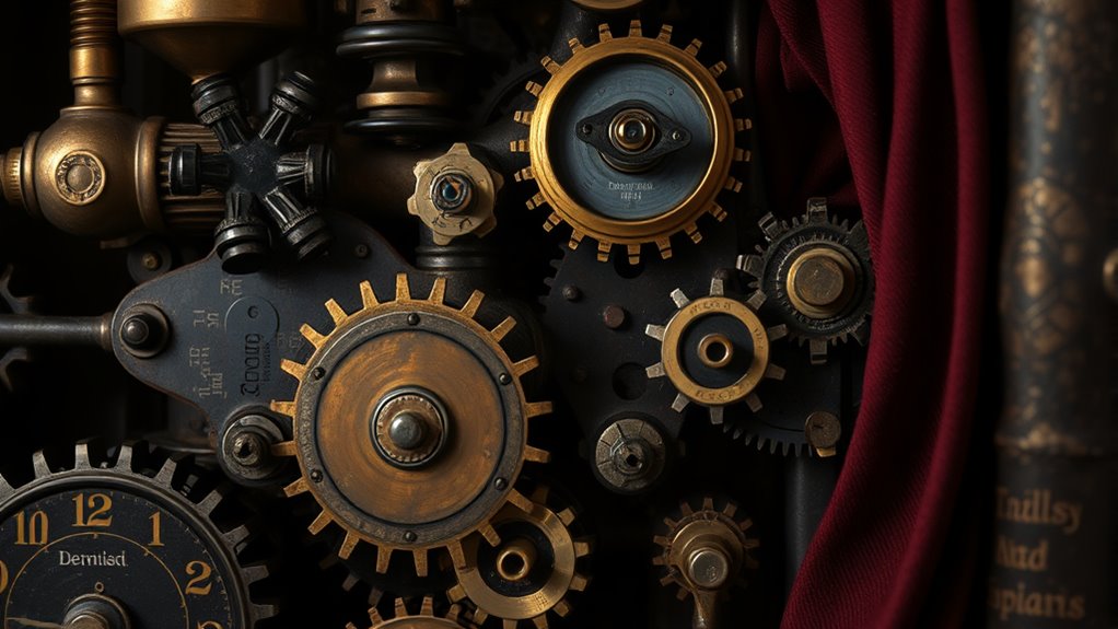

Steampunk favors dark tones because they create a gritty, industrial vibe that emphasizes resilience, mystery, and strength. Deep browns, blacks, and charcoal serve as strong backgrounds, making metallic accents like brass and copper stand out sharply. These hues evoke environments filled with smoke, steel, and vintage machinery, fostering a sense of adventure and rugged beauty. If you keep exploring, you’ll uncover how these colors shape the enthralling story behind steampunk’s unique style.
Key Takeaways
- Dark tones create a moody, mysterious atmosphere that aligns with steampunk’s themes of intrigue and adventure.
- Deep hues serve as visual anchors, making metallic accents and intricate details stand out vividly.
- Using dark colors evokes industrial environments like smoky factories, enhancing the gritty, raw aesthetic.
- Dark tones symbolize resilience, strength, and durability, reflecting the steampunk world’s mechanical and Victorian influences.
- Contrasting dark backgrounds with metallic shades adds depth and texture, fostering a sense of timeless innovation.
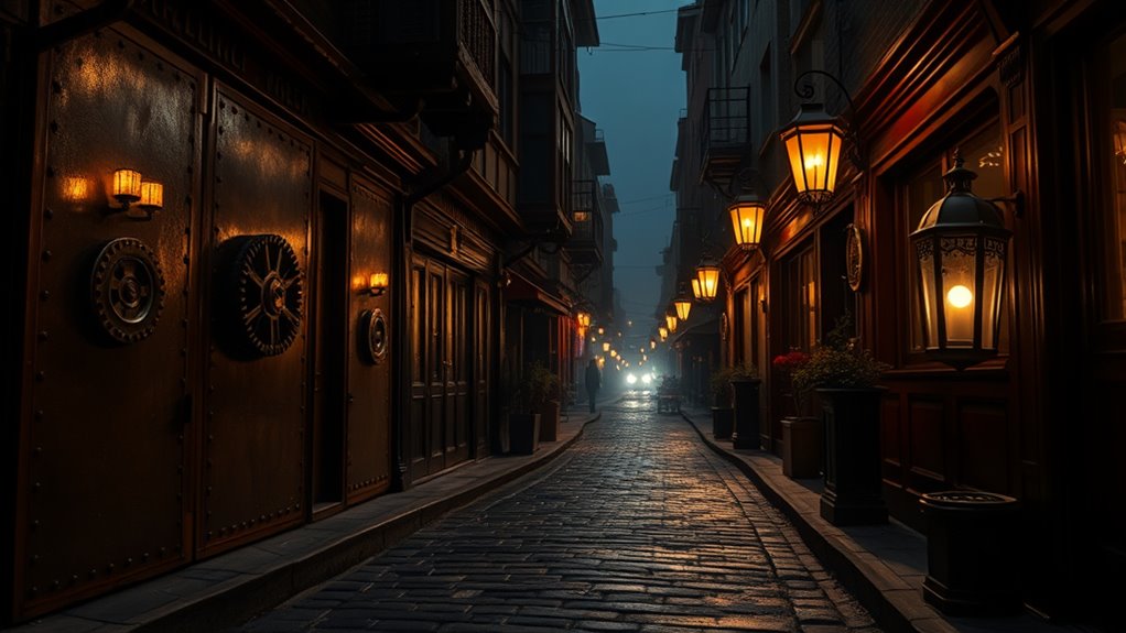
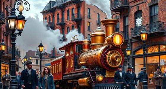
Steampunk color psychology blends vintage industrial hues with Victorian elegance to evoke a sense of adventure and innovation. When you immerse yourself in this style, you’ll notice how the colors set the tone for a world where old-world charm meets mechanical ingenuity. Industrial hues like burnt sienna, brass, and charcoal evoke a gritty, raw energy that underscores the mechanical backbone of steampunk design. These shades aren’t just about aesthetics; they communicate strength, resilience, and a touch of rugged sophistication. Paired with vintage palettes—rich burgundies, olive greens, and antique golds—they create a nostalgic yet forward-looking atmosphere that sparks curiosity and creativity.
Steampunk colors blend vintage industrial hues with Victorian elegance, evoking adventure, resilience, and inventive charm.
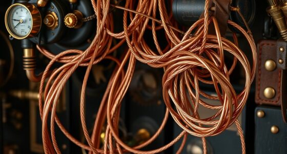
You’ll find that dark tones play an essential role in reinforcing the style’s core themes. Deep browns and blacks aren’t just background colors; they act as anchors that ground the entire color scheme, giving it depth and a sense of mystery. These shades help to evoke the industrial revolution’s gritty factories and smoky atmospheres, making the environment feel tangible and immersive. When you incorporate dark tones, you’re emphasizing a sense of seriousness and weight, which complements the Victorian influence—an era marked by grandeur and complexity. This contrast between dark and metallic hues makes the steampunk aesthetic feel layered and textured, as if each piece tells a story of innovation and rugged beauty.
Using dark tones in your steampunk palette also encourages a sense of intrigue. When you combine these shades with metallic accents or vintage palettes, you create visual interest that draws the eye and invites closer inspection. The dark tones act as a backdrop that makes brass, copper, and tarnished silver pop, highlighting their intricate details. This contrast enhances the overall storytelling aspect of steampunk, where every element hints at a bygone era filled with mystery and invention. If you’re aiming to craft a space or design that feels both timeless and futuristic, leaning into dark tones with industrial hues and vintage palettes will help you achieve that perfectly.
Ultimately, the preference for dark tones in steampunk color psychology isn’t accidental. It’s about creating a mood—one that’s adventurous, resilient, and steeped in history. These hues reflect the grit and glamour of a world driven by mechanical innovation, where every rusted gear and tarnished metal piece has a story to tell. When you embrace these dark tones, you’re not just choosing colors; you’re designing an experience that transports people to a world where vintage elegance and industrial strength collide. Incorporating color psychology can help you effectively evoke the intended emotional response and atmosphere within your designs.
Top picks for "steampunk color psychology"
Open Amazon search results for this keyword.
As an affiliate, we earn on qualifying purchases.
Frequently Asked Questions
How Do Metallic Shades Influence Steampunk Aesthetics?
Metallic shades strongly influence steampunk aesthetics by adding industrial metallics that evoke a sense of machinery and innovation. You notice metallic symbolism in gear accents and vintage gadgets, which create a rugged, yet sophisticated look. These industrial metallics complement dark tones, enhancing the style’s gritty, steampunk vibe. By incorporating brass, copper, and silver, you achieve a timeless, mechanical feel that captures the essence of this imaginative genre.
Can Pastel Colors Be Integrated Into Steampunk Designs?
Absolutely, you can incorporate pastel colors into steampunk designs. Play with pastel contrasts to create mesmerizing, quirky combinations, and add soft accents to balance the bold, dark tones typical of the style. By blending delicate hues with rugged, retro elements, you craft a charming, unique aesthetic that’s both whimsical and vintage. So, don’t hesitate—integrate pastels to add a fresh, fun flair to your steampunk creations.
What Psychological Effects Do Warm Tones Evoke in Steampunk?
Warm tones evoke feelings of psychological warmth and emotional comfort in steampunk designs. When you incorporate rich browns, deep oranges, or metallic golds, you create an inviting atmosphere that feels cozy and nostalgic. These colors help you connect emotionally with the vintage and industrial elements, making the space or object more approachable and engaging. As a result, warm tones enhance the overall steampunk aesthetic by fostering a sense of familiarity and warmth.
Are There Cultural Variations in Steampunk Color Preferences?
You’ll find that steampunk color preferences do vary culturally, influenced by regional color trends and symbolism. In Western cultures, brass and sepia tones evoke nostalgia, while in Japan, vibrant reds and golds highlight tradition and prosperity. These cultural differences shape how fans interpret steampunk aesthetics, making the style uniquely adaptable worldwide. Exploring these variations reveals how cultural symbolism influences color choices, enriching the steampunk experience across diverse regions.
How Do Lighting Conditions Alter Perceived Steampunk Colors?
Lighting conditions profoundly influence how you perceive steampunk colors. Under dim or warm lighting, lighting illusions can make dark tones appear richer and more mysterious, enhancing the vintage feel. Bright or cool lighting increases color contrast, revealing subtle details and making metallic accents pop. You’ll notice that shifting lighting can transform your perception, highlighting different aspects of steampunk aesthetics and enriching your overall experience with its unique color palette.
Conclusion
As you immerse yourself in steampunk’s world, remember that its dark tones are like shadows whispering secrets of mystery and adventure. These colors don’t just set the mood—they evoke your imagination, pulling you into a universe where Victorian elegance meets industrial grit. Embrace the deep hues, and let them be the compass guiding your style journey. After all, in steampunk, the darkness isn’t just absence of light—it’s the canvas for your story to unfold.