During the 50s and 60s, you’ll notice that Formica countertops embodied the era’s vibrant, optimistic style. They featured bold colors like pastels and sunny yellows, often with shiny, glossy finishes that made kitchens feel brighter and more modern. Patterns ranged from checkered diner-inspired motifs to abstract designs, reflecting progress and fun. These surfaces weren’t just practical—they captured a lively culture of innovation. Keep exploring, and you’ll uncover more about how these designs shaped a memorable American aesthetic.
Key Takeaways
- Formica was the dominant material due to its affordability, durability, and versatility in patterns and colors.
- Countertop designs of the era reflected modernity, featuring bold patterns, shiny surfaces, and streamlined, diner-inspired aesthetics.
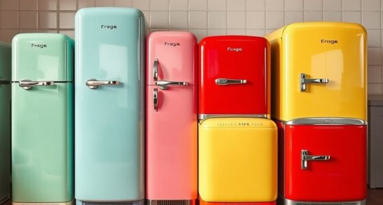
- Pastel color schemes like pinks, mint greens, and yellows became popular, embodying optimism and cheerful living.
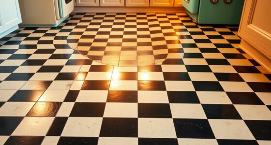
- Metallic accents and checkered motifs emphasized progress, innovation, and a lively, upbeat cultural vibe.
- The designs expressed societal optimism, celebrating modern living, comfort, and a distinctive, cheerful aesthetic.
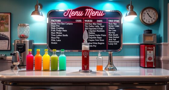
During the 1950s and 1960s, countertop design reflected the era’s fascination with modernity and innovation. You’d notice that kitchen surfaces weren’t just functional—they embodied a sense of style inspired by the vibrant, fast-paced culture of the time. Diner-inspired designs became especially popular, capturing the casual, upbeat vibe of roadside restaurants and drive-ins. These designs often featured bold patterns, shiny surfaces, and a streamlined aesthetic that conveyed a sense of motion and progress. Bright, eye-catching colors and sleek finishes made them stand out as statement pieces in any kitchen. The emphasis was on creating a space that felt lively, inviting, and modern—mirroring society’s excitement for the future.
1950s and 60s countertops showcased bold patterns, shiny surfaces, and vibrant colors inspired by diner culture and modern innovation.
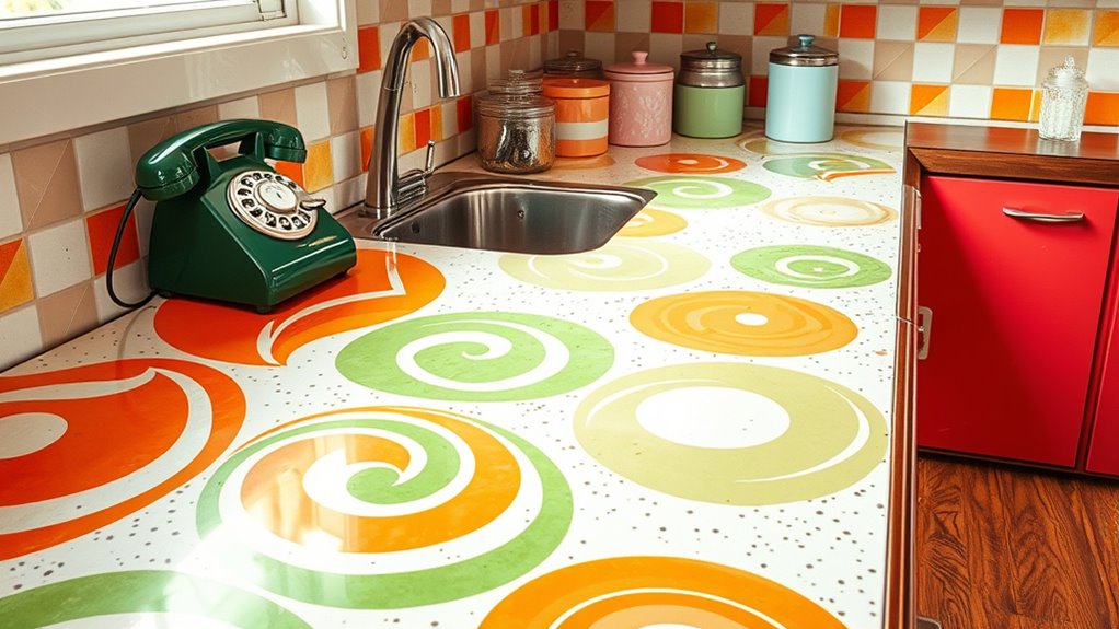
Color played a pivotal role in defining these countertops. Pastel color schemes, in particular, gained momentum and became almost synonymous with the era. Soft pinks, mint greens, baby blues, and sunny yellows flooded kitchens, giving them a cheerful, welcoming feel. These pastel hues weren’t just choices—they reflected a broader cultural shift toward optimism and comfort in post-war America. You’d see these colors in appliances, wall paint, and, of course, countertops, often paired with glossy finishes that enhanced their vibrancy. The smooth, shiny surfaces made cleaning easier and added to the cheerful aesthetic. They also complemented the rounded, curvaceous furniture common in the period, creating a cohesive look that felt fresh and inviting.
Formica, the dominant material of the time, became the go-to choice for countertops because it could easily mimic the stylish looks of the era while remaining affordable and durable. Its versatility allowed designers to experiment with a variety of patterns and colors, from solid pastels to intricate patterns that resembled tiles or abstract art. You’d often find Formica countertops with a glossy surface, reflecting light and making the space seem brighter and more open. The ability to incorporate diner-inspired motifs—such as checkered patterns or metallic accents—made Formica a favorite among homeowners seeking a modern, playful kitchen vibe. It was durable enough to stand up to everyday use, yet stylish enough to make a statement.
All these elements—diner-inspired designs, pastel color schemes, and the popularity of Formica—intertwined to create a distinctive look that defined the kitchens of the 50s and 60s. They weren’t just surfaces; they were expressions of a cultural optimism that celebrated progress, comfort, and a dash of fun. When you look back at this period, it’s clear that countertops weren’t just practical surfaces—they were a key part of the era’s identity, capturing the spirit of innovation and the joy of modern living.
vintage Formica countertop
As an affiliate, we earn on qualifying purchases.
As an affiliate, we earn on qualifying purchases.
Frequently Asked Questions
Were There Any Eco-Friendly Countertop Options During the 50S and 60S?
During the 50s and 60s, eco-friendly countertop options were limited, but you might find early recycling innovations in materials like wood or recycled metal, which were occasionally used. Biodegradable surfaces weren’t common then, as most materials weren’t designed for sustainability. However, some homeowners experimented with natural stone or wood, appreciating their durability and potential for reuse, even if they weren’t explicitly marketed as eco-friendly.
How Did Socioeconomic Factors Influence Countertop Choices in That Era?
Your economic class and material availability greatly influenced your countertop choices in that era. If you belonged to the middle class, you likely opted for affordable options like Formica, which was widely accessible and budget-friendly. Wealthier households could afford more luxurious materials, but overall, the availability of cost-effective materials shaped most people’s decisions, making practicality and affordability the main factors in selecting countertops during the 50s and 60s.
Did Any Celebrities or TV Shows Popularize Specific Countertop Styles?
Imagine a world where your kitchen style is shaped by stars—celebrity endorsements and TV influence made certain countertops iconic. During the 50s and 60s, popular TV shows and famous personalities showcased specific styles, turning them into must-haves. These endorsements made colorful Formica and sleek surfaces irresistible, guiding homeowners’ choices. You can see how media power turned everyday countertops into symbols of status, elegance, and modernity.
What Safety Concerns Existed With Formica and Similar Materials Then?
You should be aware that back then, safety concerns with Formica and similar materials included chemical hazards from the adhesives and finishes, which could emit harmful fumes. Additionally, these countertops posed fire risks due to their flammability, especially when exposed to heat or open flames. Proper ventilation and careful handling were essential to reduce health dangers and prevent accidents, though safety standards were less strict than today.
How Did Regional Tastes Affect Countertop Trends Across the US?
Think of countertops as a canvas reflecting regional preferences and cultural influences. In the South, warm, earthy tones mimicked natural landscapes, while in the Northeast, sleek, modern styles symbolized progress. You see, these trends weren’t just about aesthetics—they echoed local identities and values. By embracing regional tastes, homeowners made a statement, turning everyday surfaces into symbols of their community’s character and history.
1950s style kitchen backsplash
As an affiliate, we earn on qualifying purchases.
As an affiliate, we earn on qualifying purchases.
Conclusion
So, while those colorful Formica countertops of the 50s and 60s might seem a bit quaint now, they remind us how tastes gently shift over time. What once felt fresh and modern can softly fade into charming nostalgia, hinting at the ever-evolving nature of design. Embrace the history and quirks of those bygone eras—they’re just waiting to inspire your next creative twist in the world of home decor.
retro pastel kitchen accessories
As an affiliate, we earn on qualifying purchases.
As an affiliate, we earn on qualifying purchases.
diner-inspired kitchen decor
As an affiliate, we earn on qualifying purchases.
As an affiliate, we earn on qualifying purchases.