If you’re exploring retro color schemes, you’ll want to focus on iconic hues like avocado green and mustard yellow. These colors evoke the warm, bold spirit of mid-century design, creating authentic vintage vibes in any space or project. Pairing these shades with complementary tones enhances their nostalgic charm and visual impact. By choosing the right vintage hues, you can craft lively, timeless designs that truly stand out—stay with us to discover more about creating perfect retro palettes.
Key Takeaways
- Vintage hues like avocado green and mustard yellow evoke mid-century nostalgia and authentic retro vibes.
- These colors are bold, warm, and cheerful, reflecting the optimism of 1950s and 1960s design eras.
- Pairing vintage shades with whites or browns enhances contrast and visual harmony in retro-inspired spaces.
- Using earth tones and subdued shades maintains authenticity and timeless appeal in vintage color schemes.
- Understanding color psychology helps select hues that evoke specific moods and amplify nostalgic atmospheres.
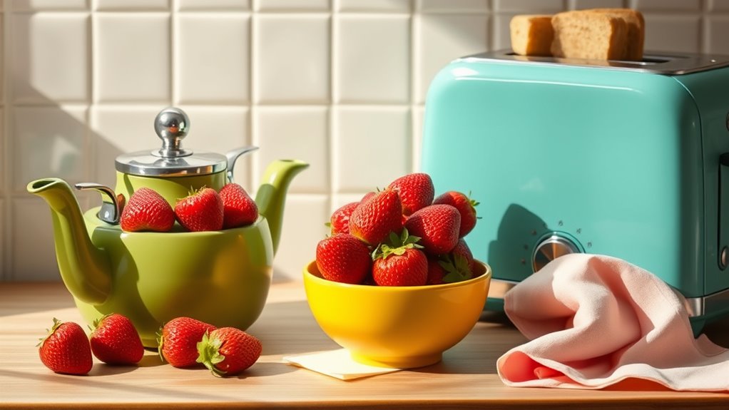
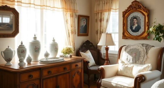
Ever wondered how to capture the vibrant, nostalgic feel of retro styles? It all starts with understanding the power of color. Retro color palettes are more than just hues; they’re a reflection of a unique era that still influences design today. When diving into vintage design trends, one of the best ways to evoke that authentic feel is by selecting the right colors. Mid-century palettes, for example, are characterized by their bold yet warm tones that instantly transport you back to the 1950s and 1960s. Think avocado green, mustard yellow, and burnt orange—the classics that defined countless kitchens, living rooms, and fashion statements of the time.
Retro colors like avocado green and mustard yellow evoke nostalgic 1950s and 1960s design.
These mid-century palettes are essential for anyone aiming to create a genuinely retro vibe. They’re not just colors; they’re symbols of a design movement that prioritized simplicity, functionality, and cheerful optimism. Incorporating vintage design trends involves choosing hues that have stood the test of time, and that instantly conjure feelings of nostalgia. For instance, avocado green isn’t just a shade of green—it’s a statement. It evokes the popular kitchen appliances and décor that became iconic during the mid-century era. Similarly, mustard yellow adds a pop of warmth and energy without overpowering the overall aesthetic. These colors work beautifully together, creating a harmonious balance of vibrancy and subtlety.
Using these vintage hues isn’t just about paint or fabric; it’s about creating an ambiance that feels both fresh and familiar. When you select colors like these for your space or project, you’re tapping into a rich history of design innovation. Retro color palettes often emphasize contrast, so pairing avocado green with crisp whites or mustard yellow with dark browns can produce striking visuals that feel both timeless and lively. The key is to keep it authentic; avoid over-saturating your design with too many modern shades that clash with the vintage vibe. Instead, focus on the subdued, earthy tones that characterize mid-century palettes, and let those hues do the heavy lifting in creating an atmosphere full of personality and history.
In addition, understanding color psychology can help you choose hues that evoke specific moods and enhance the vintage atmosphere. Ultimately, embracing vintage design trends through well-chosen colors like avocado green and mustard yellow allows you to craft spaces and styles that are both nostalgic and fresh. These hues carry a story, a mood, and a timeless charm that continue to inspire contemporary designers and enthusiasts alike. So, if you’re passionate about retro aesthetics, start experimenting with these classic shades—your project will radiate authenticity and personality, making it truly stand out.
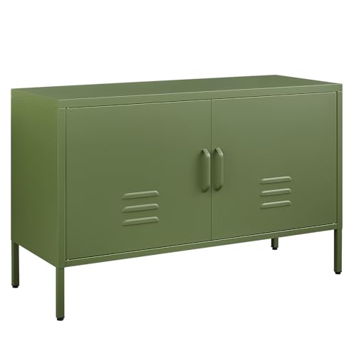
IRONFFICE Metal Storage Cabinet,Metal Cabinet with Doors and Adjustable Shelf,TV Stand with Storage,Morden TV Cabinet for Bedroom,Living Room,Avocado Green
【𝐃𝐮𝐫𝐚𝐛𝐥𝐞 𝐐𝐮𝐚𝐥𝐢𝐭𝐲】This green metal cabinet is made of heavy-duty metal frames for strength and durability, with an eco-friendly…
As an affiliate, we earn on qualifying purchases.
As an affiliate, we earn on qualifying purchases.
Frequently Asked Questions
How Can I Incorporate Vintage Hues Into Modern Decor?
You can incorporate vintage hues into modern decor by mixing popular vintage color pairings like avocado green with mustard yellow or burnt orange. Use these colors in accent pieces, such as throw pillows, artwork, or furniture. Understanding the history of vintage hues helps you create a nostalgic vibe, balancing bold retro shades with sleek modern decor to make your space feel both timeless and trendy.
Are Retro Colors Suitable for All Room Sizes?
Retro colors can work well in any room size if you focus on color harmony and balance. Lighter shades like mustard yellow or avocado green make small rooms feel more open, while bold vintage hues add character to larger spaces. Historical inspirations behind these colors can help you create a cohesive look that enhances your room’s proportions. So, don’t shy away—use retro colors thoughtfully to suit your space’s size and style.
What Clothing Styles Best Complement Vintage Color Palettes?
You should opt for clothing styles that highlight vintage color palettes by pairing vintage palettes with classic silhouettes like A-line skirts, high-waisted jeans, or flowy dresses. To accessorize retro outfits, choose bold jewelry, retro sunglasses, or statement belts that complement the hues. These choices create a cohesive look, making your outfit feel authentic and stylish. Mixing modern pieces with vintage colors also adds a fresh, personalized touch.
How Do Retro Colors Influence Mood and Ambiance?
Retro colors like avocado green and mustard yellow profoundly influence your mood and ambiance through color psychology. These hues evoke feelings of warmth, nostalgia, and comfort, creating a cozy, inviting atmosphere. Their emotional impact can boost your happiness and relaxation, making spaces feel lively yet soothing. By choosing vintage-inspired shades, you tap into nostalgic energy that positively affects your emotional well-being and enhances your environment’s overall vibe.
Can Retro Hues Be Mixed With Contemporary Design Elements?
You can absolutely mix retro hues with contemporary design elements for a fresh look. Start with a bold vintage color palette pairing, like avocado green with sleek, modern furniture. This contrast creates visual interest and highlights vintage color psychology, which evokes warmth and nostalgia. By balancing these elements thoughtfully, you’ll craft a space that feels both timeless and trendy, making your design uniquely vibrant and inviting.

Cotton Floral Pillow Covers 16×16: Mustard Yellow Decorative Vintage Rustic Patterned Throw Pillows – Farmhouse Boho Couch Sofa Cushions Pillowcase Pack of 2 Living Room Square Throw Pillow Covers
PACKAGING: COVER ONLY.Includes vintage mustard yellow floral 16×16 pillow covers set of 2(40 x 40CM no inserts). single-sided…
As an affiliate, we earn on qualifying purchases.
As an affiliate, we earn on qualifying purchases.
Conclusion
Now that you’re familiar with retro hues like avocado green and mustard yellow, it’s time to incorporate these vintage shades into your space. Did you know that a 2022 survey found that 65% of homeowners are drawn to retro colors for their nostalgic appeal? So go ahead, experiment with these hues to create a timeless vibe that sparks both comfort and style. Embrace the past to make your space uniquely yours!

JOINICE Mid Century Modern Bedroom Set, 6 Drawer Dresser and Nightstand Sets for Bedroom, Night Stand Set 2 & 6 Drawer Dresser with Gold Handles, Wood Chest of Drawers Storage Cabinet Set, Walnut
Refined Mid-Century Modern Style: Add timeless charm to your bedroom with this dresser and nightstand sets 3 piece….
As an affiliate, we earn on qualifying purchases.
As an affiliate, we earn on qualifying purchases.
Hulameda Paint Tray Palettes, Plastic Paint Pallets for Kids or Students to Paints on School Project or Art Class-12pcs
★【Premium Paint Palette】 – It’s made of plastic high quality, sturdy, durable. Our palettes have the advantages of…
As an affiliate, we earn on qualifying purchases.
As an affiliate, we earn on qualifying purchases.