
Mid-century colors like turquoise, orange, and olive played a key role in shaping the era’s bold, optimistic style. Turquoise offers a revitalizing, calming vibe that balances vibrancy, while orange adds warmth and energy to spaces. Olive provides a sophisticated foundation, grounding brighter hues and creating a timeless look. Together, these colors created a distinctive visual identity that continues to influence modern design. Explore further to discover more about their enduring appeal and style secrets.
Key Takeaways
- Turquoise symbolizes revitalization and balance, embodying the optimistic, forward-looking spirit of mid-century design.
- Orange exudes warmth and energy, promoting interaction and vibrancy in mid-century interiors and furniture.
- Olive offers a subdued, sophisticated tone that grounds brighter colors and adds depth to vintage palettes.
- The combination of these hues reflects innovation, emotional connection, and the era’s playful yet refined aesthetic.
- Vintage palettes featuring turquoise, orange, and olive continue to influence contemporary mid-century modern design.

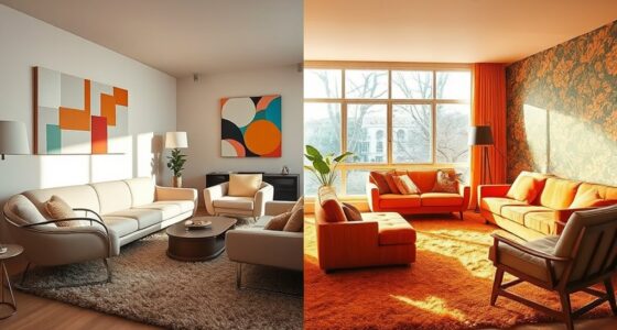
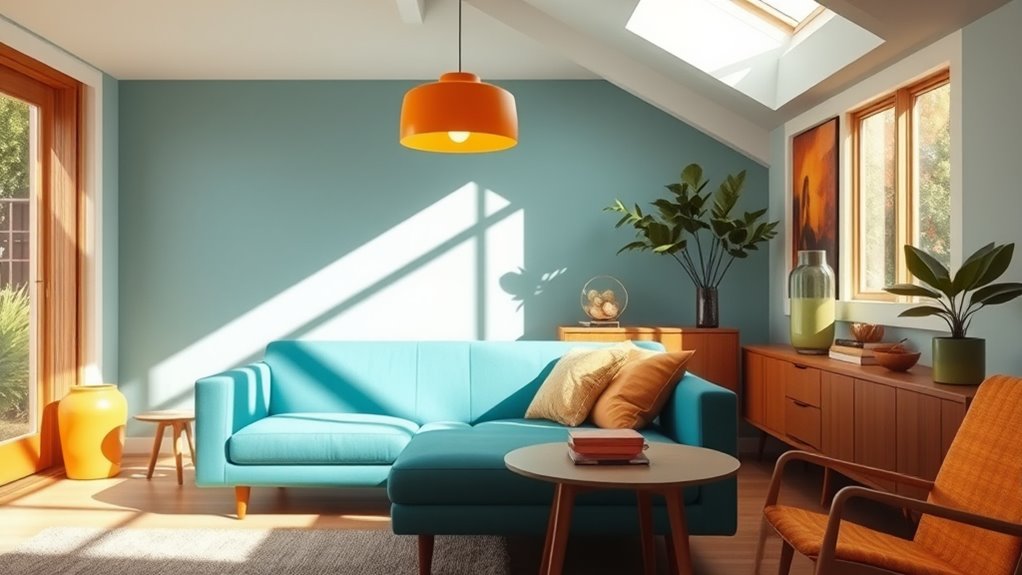
Have you ever wondered how color transformed mid-century design from simple to striking? During that era, designers embraced bold, vibrant hues that revolutionized the look of interiors and furniture alike. This shift wasn’t just about aesthetics; it was a reflection of optimism and forward-thinking. The mid-century modern shades, like turquoise, orange, and olive, became iconic, defining an era that celebrated both form and function. These colors weren’t chosen at random—they were part of carefully curated vintage color palettes that aimed to energize spaces and evoke emotion. When you explore mid-century design, you’ll notice how these hues stand out, creating a lively, welcoming atmosphere that still resonates today.
Color transformed mid-century design into a vibrant, optimistic celebration of form and function.
Turquoise, with its cool, revitalizing vibe, became a standout choice in mid-century palettes. It’s a color that balances tranquility with vibrancy, making it perfect for accent pieces or larger surfaces. Its popularity wasn’t accidental; turquoise encapsulated the optimistic spirit of the 1950s and 60s, symbolizing clarity and freshness. Whether seen in ceramic accessories, upholstered furniture, or wall paint, this shade injects a sense of calmness while simultaneously catching the eye. Its versatility allows it to pair beautifully with warm oranges or earthy olives, creating a dynamic contrast that energizes any space.
Orange, on the other hand, radiates warmth and enthusiasm. It’s a color that invites interaction and adds a burst of energy to any room. Mid-century designers loved using orange because it broke away from the subdued tones of previous eras, bringing a lively, modern touch to interiors. You might find it in bold accent chairs, decorative objects, or even wall treatments. Orange’s vibrancy works well with neutral backgrounds, but it also complements other mid-century modern shades, creating a harmonious yet eye-catching palette. Its cheerful nature made it a favorite for kitchens, living rooms, and even outdoor spaces, reinforcing the era’s love for bold, playful design.
Olive, a more subdued yet sophisticated hue, offered balance within the vibrant palette. It’s a versatile shade that grounds the brighter colors, adding depth and a touch of nature-inspired calm. Olive green was often used in furniture upholstery, rugs, and accent walls, providing a sophisticated backdrop that allowed brighter colors to pop. It reflects a connection to the organic and natural, which was increasingly valued during the mid-century period. When combined with vintage color palettes, olive creates a timeless look that remains relevant today, blending retro charm with modern sensibility.
Furthermore, the careful selection of these vintage color palettes was crucial in shaping the visual identity of mid-century design, emphasizing innovation and emotional connection.
Top picks for "century color significance"
Open Amazon search results for this keyword.
As an affiliate, we earn on qualifying purchases.
Frequently Asked Questions
How Did Mid-Century Color Trends Influence Modern Interior Design?
You can see how mid-century color trends influence modern interior design by shaping psychological effects and highlighting historical symbolism. Bright turquoise energizes spaces, while warm orange fosters comfort and enthusiasm. Olive tones add a touch of nature and balance. These colors evoke nostalgia and optimism, inspiring contemporary designers to create vibrant, meaningful environments. Your choices today reflect that era’s bold, expressive spirit, blending history with modern style seamlessly.
What Cultural Movements Inspired the Use of Turquoise, Orange, and Olive?
You’re inspired by art deco influences and bohemian color palettes that shaped the use of turquoise, orange, and olive. These movements emphasize bold, vibrant hues that reflect luxury, creativity, and free-spiritedness. Art deco’s geometric elegance and bohemian’s eclectic charm encourage mixing these colors to create lively, distinctive spaces. Their cultural roots push you to embrace expressive, colorful interiors that stand out and evoke a sense of artistic freedom.
Are These Colors Still Popular in Contemporary Decorating Styles?
Yes, these colors are still popular in contemporary decorating styles, driven by a vintage revival trend. You’ll notice turquoise, orange, and olive making a comeback in modern interiors because they evoke nostalgia and add vibrant energy. Plus, understanding color psychology helps you appreciate how these hues influence mood—turquoise for calm, orange for enthusiasm, and olive for balance—making them versatile choices for stylish, meaningful spaces today.
How Can These Colors Be Incorporated Into a Minimalist Aesthetic?
You can incorporate these colors into a minimalist aesthetic by using them as neutral accents. For example, choose a turquoise throw pillow or an orange vase to add a pop of color without overwhelming the space. Use monochrome layering with olive green in your furniture or decor to create subtle depth. This approach keeps your minimalist design clean while giving it a vibrant, mid-century-inspired touch.
What Are the Best Complementary Colors to Pair With Turquoise, Orange, and Olive?
You should look at the color wheel for the best complementary options. For turquoise, try coral or warm reds to create striking contrasting schemes. Orange pairs beautifully with blue or teal, adding vibrancy through contrasting colors. Olive works well with deep purples or burgundy, enhancing its earthy tone. Using contrasting color schemes based on these relationships helps you craft balanced, eye-catching designs that highlight each color’s unique charm.
Conclusion
As you immerse yourself in mid-century colors, remember that these hues—turquoise, orange, and olive—capture the essence of a time when innovation met tradition. Like slipping on your vintage aviator sunglasses, embracing these shades transports you to an era that’s both nostalgic and timeless. While some might think it’s just retro style, these colors hold a secret: they remind us that true elegance never truly goes out of fashion, even as you scroll through your social media feed.