
Decorating with retro Pantone colors of the year lets you create vibrant, nostalgic spaces that blend bold hues with modern styles. You can choose striking yellows, rich teals, or soft pastels as your base, then add vintage accent pieces like lamps or rugs for character. Pair sleek, contemporary furniture with vintage accessories to make your decor lively and balanced. Keep exploring to discover how to seamlessly incorporate these colors for a truly timeless yet fresh look.
Key Takeaways
- Incorporate vintage accent pieces like patterned rugs or ceramic vases in Pantone shades for nostalgic appeal.
- Combine bold retro Pantone colors with modern furniture for a balanced, vibrant aesthetic.
- Use textures and patterns from the era to enhance and harmonize the color scheme.
- Select wall paints, textiles, and accessories inspired by Pantone shades to create cohesive decor.
- Personalize your space by mixing vintage and contemporary elements that reflect your unique style.

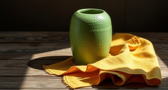
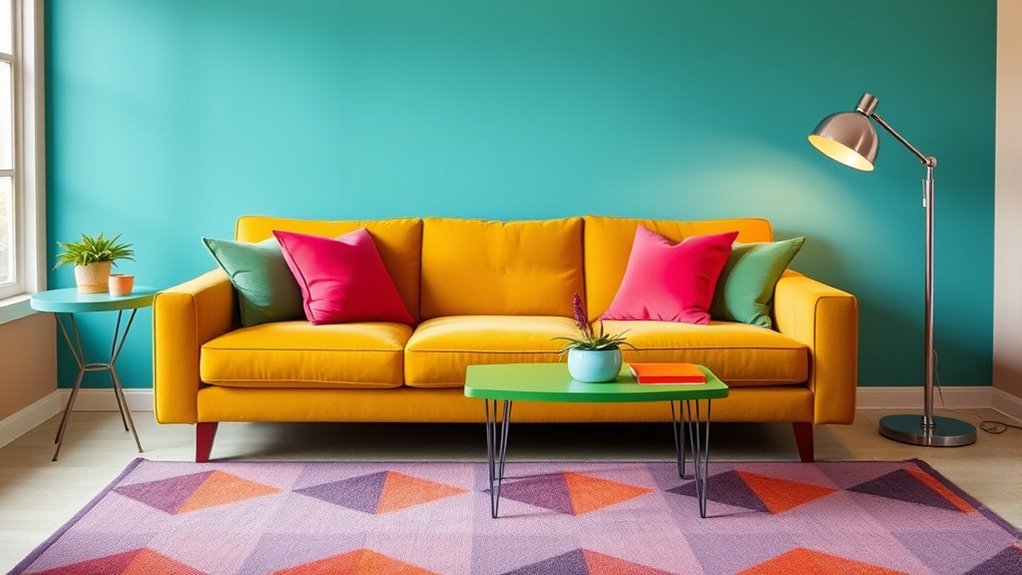
If you’re looking to add a fresh yet nostalgic touch to your decor, embracing the retro Pantone Colors of the Year is a perfect choice. These hues can serve as a vibrant foundation for your space, inspiring you to craft a unique and lively environment. By blending bold retro tones with modern design elements, you create a look that feels both timeless and current. To start, explore color palette inspiration that draws from these Pantone shades. Think about combining striking yellows, rich teals, or soft pastels—colors that evoke a bygone era while remaining versatile enough to suit contemporary tastes. Use these as a jumping-off point for choosing wall paint, textiles, and accessories, ensuring your space feels cohesive yet full of personality. Incorporating vintage accent pieces is one of the easiest ways to bring retro Pantone colors into your home. Look for items that immediately evoke a sense of nostalgia—such as mid-century modern lamps, patterned rugs, or ceramic vases—that feature the Pantone shades you’ve chosen. These accents serve as focal points, adding depth and character without overwhelming your space. You don’t need to overhaul everything; instead, select a few key vintage pieces that resonate with you. For example, a retro-inspired armchair upholstered in a vibrant Pantone hue can anchor your living room, while a colorful ceramic dish on your shelf adds subtle charm. These vintage touches not only enhance your color palette but also give your decor that authentic, curated feel. Mixing retro colors with modern furniture is another effective strategy. Pair a sleek, minimalist sofa with throw pillows in bold Pantone shades, or add a vintage-patterned curtain to a plain wall. This contrast creates visual interest and highlights the playful, eclectic vibe that retro colors can evoke. When selecting vintage accent pieces, keep an eye out for textures and patterns characteristic of the era—geometric prints, terrazzo surfaces, or glossy finishes—that complement the Pantone hues. This combination results in a space that feels lively and inviting, yet thoughtfully curated. Exploring timeless design principles can help you balance bold colors and vintage elements seamlessly. Ultimately, decorating with retro Pantone Colors of the Year allows you to express your personality while paying homage to iconic design eras. By drawing color palette inspiration from these shades and thoughtfully incorporating vintage accent pieces, you can craft a space that’s both nostalgic and fresh. It’s all about balancing bold color choices with carefully curated accessories, creating a harmonious environment that’s uniquely yours.
Frequently Asked Questions
How Can I Incorporate Retro Pantone Colors Into Small Spaces Effectively?
To incorporate retro Pantone colors into small spaces effectively, start with strategic furniture placement to maximize space and highlight bold hues. Use wall accents like artwork or wallpaper in those retro shades to add visual interest without overwhelming the room. Keep larger furniture neutral, and add pops of color through accessories and decor. This approach creates a vibrant, cohesive look that feels lively yet balanced in any small area.
What Are the Best Complementary Colors for Retro Pantone Hues?
You’re on the right track, as the right complementary colors can make your retro hues pop. Use color wheel pairings like bold oranges with blues or vibrant pinks with greens for striking contrasts. These complementary color schemes create harmony and balance, but don’t be afraid to experiment—sometimes opposites attract! Keep in mind that a little goes a long way, so incorporate these hues thoughtfully to enhance your space without overwhelming it.
How Do I Choose Retro Pantone Colors for Different Seasons?
You should choose retro Pantone colors for different seasons by exploring seasonal color palettes that reflect the mood and environment of each time of year. Consider vintage color trends to guide your selections, blending warm tones for fall, cool shades for winter, fresh hues for spring, and vibrant colors for summer. This approach helps create a harmonious, seasonally appropriate space that captures the charm of retro style.
Can Retro Pantone Colors Be Used in Modern Minimalist Designs?
You can absolutely use retro Pantone colors in modern minimalist designs—think of it as adding a burst of vintage excitement to sleek, clean spaces. Use color blocking with bold retro shades to create striking focal points, while vintage accents like retro-inspired decor keep the look fresh. Embrace the contrast, and you’ll craft a minimalist space with a playful, timeless vibe that surprises and delights.
Are There Specific Retro Pantone Shades Suited for Children’s Rooms?
Yes, there are vintage nursery palettes and playful color combinations perfect for children’s rooms. Retro Pantone shades like soft teals, cheerful yellows, and gentle pinks create a lively yet cozy atmosphere. You can mix these shades to add a touch of nostalgia while keeping the space fun and vibrant. These colors work well for accent walls, bedding, or decor, making the room appealing and stimulating for kids.
Conclusion
Embracing retro Pantone colors of the year lets you blend nostalgia with modern flair. Imagine a vintage-inspired living room, where bold, vibrant hues sit beside sleek, minimalist furniture—creating a playful contrast. These colors transform your space into a dynamic canvas, where past and present collide in perfect harmony. So, don’t hesitate to infuse your home with these timeless shades; they’re the bridge that connects cherished memories with fresh, contemporary style.